🔥 Limited Spots: 40-Hour Proof of Concept for $2,500 | Tokyo 🇯🇵 & Delhi 🇮🇳 Offices | Claim Your Spot →
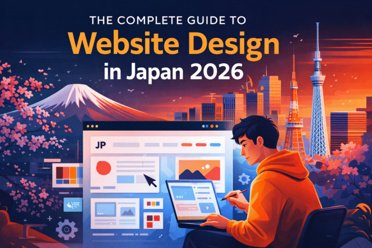
A Comprehensive Analysis of Cultural, Visual, and Functional Distinctions
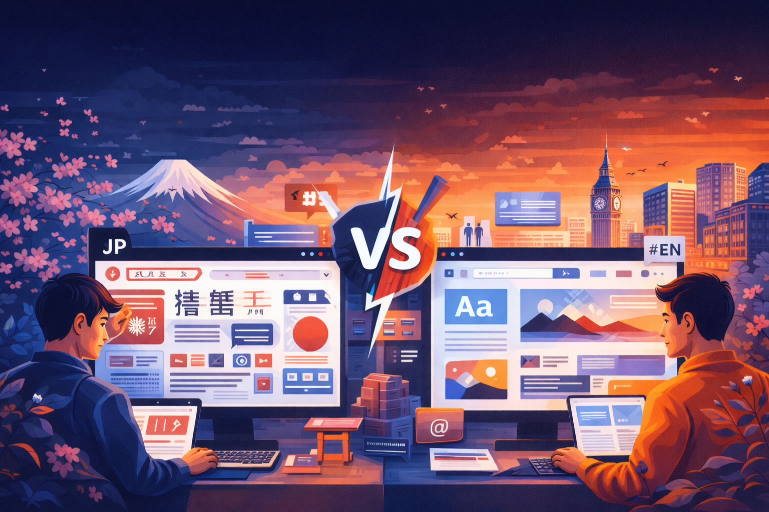
If you’ve ever browsed a Japanese website after spending time on Western sites, you’ve likely experienced a moment of culture shock. Japanese websites look fundamentally different—not because of inferior design skills, but because they reflect profoundly different cultural values, user expectations, and communication styles.
This comprehensive guide explores 15 critical differences between Japanese and English web design. Whether you’re a designer creating a site for the Japanese market, a business owner expanding into Japan, or simply curious about cross-cultural design, understanding these distinctions is essential for success.
These differences aren’t arbitrary—they’re rooted in centuries of cultural development, different writing systems, and distinct approaches to information processing and decision-making. Let’s explore each difference in depth and understand why they matter.
1. Information Density: More is More vs. Less is More
Perhaps the most striking difference between Japanese and Western web design is the approach to information density. Western design philosophy, particularly influenced by Apple and Google, champions minimalism. The mantra is ‘less is more’—remove everything unnecessary until only the essential remains.
Japanese design takes the opposite approach. Japanese websites are information-rich, featuring multiple competing elements, dense text blocks, numerous images, and comprehensive content visible without clicking. What Western designers might call ‘cluttered,’ Japanese users consider thorough and trustworthy.
Why This Difference Exists:
- Japanese characters convey more information per character than English. A single kanji can represent an entire concept that would require multiple English words. This efficiency allows for denser information presentation without overwhelming readers.
- Japanese culture values thoroughness and completeness. Providing comprehensive information upfront demonstrates respect for the user’s time and helps them make informed decisions without repeated clicking.
- Japanese consumers are risk-averse and detail-oriented. They want to see all options and information before making decisions. Hidden content can create suspicion about what you’re not showing.
- The newspaper tradition in Japan features dense layouts with multiple stories competing for attention. This visual style has translated to digital media, making Japanese users comfortable with busy interfaces.
Practical Implications:
When designing for Japanese audiences, don’t hide content behind multiple clicks. Display product specifications, pricing details, and important information directly on landing pages. Use collapsible sections sparingly and only for truly supplementary content. Your homepage should provide a comprehensive overview of your business, not just an artistic statement.
2. Visual Hierarchy: Equality vs. Dominance
Western design strongly emphasizes visual hierarchy—one element should dominate each section, drawing the eye first and establishing a clear path through the content. Think of Apple product pages where a single large image commands attention before secondary elements.
Japanese design distributes visual weight more evenly. Multiple elements compete for attention simultaneously, each carrying significant visual weight. Rather than a single focal point, Japanese layouts present multiple points of interest that users can explore based on their priorities.
Cultural Foundations:
This difference reflects broader cultural values. Japanese society emphasizes group harmony and collective decision-making over individual dominance. Just as Japanese corporate culture values consensus building over individual leadership, Japanese web design distributes importance among multiple elements rather than elevating one above all others.
Additionally, the Japanese shopping experience traditionally involves browsing multiple options simultaneously. Department stores and shops display many products together, allowing customers to compare and choose based on personal preference. Websites mirror this physical shopping experience.
Design Strategy:
Create layouts where multiple content blocks have similar visual weight. Use grid systems that give equal importance to various sections. Don’t force users down a single conversion funnel—provide multiple pathways that accommodate different user priorities and browsing styles.
3. Color Usage: Restrained vs. Vibrant
Modern Western web design tends toward restrained color palettes. Many successful Western sites use primarily white backgrounds with one or two accent colors. The trend toward minimalism extends to color choices, with monochromatic or limited palettes dominating corporate websites.
Japanese websites embrace color enthusiastically. Bright reds, blues, yellows, and greens coexist on the same page. Multiple color blocks, colorful badges, and varied backgrounds create vibrancy that would be considered excessive in Western design but feels energetic and informative in Japanese contexts.
Color Meanings in Japan:
- Red: Celebration, sales, urgency. Used extensively for promotional content and special offers.
- Blue: Trust, professionalism, cleanliness. The most popular corporate color, especially for financial and healthcare sites.
- Yellow: Attention, cheerfulness. Used for highlighting important information and creating visual interest.
- Green: Nature, health, safety. Popular for environmental and wellness-related content.
- Pink: Cute (kawaii), feminine, gentle. Used more frequently than in Western design.
The abundance of color serves functional purposes. Different colors help users quickly identify different types of content—sale items, new arrivals, limited editions, or different product categories. In information-dense layouts, color coding becomes a navigation tool.
4. Navigation Philosophy: Hidden vs. Visible
Western web design increasingly favors hidden navigation—hamburger menus on mobile, dropdown menus that appear on hover, and progressive disclosure that reveals options only when needed. The philosophy is to reduce visual clutter and guide users through carefully crafted user journeys.
Japanese websites display navigation options prominently and persistently. Mega menus show multiple levels of hierarchy simultaneously. Sidebars list all available categories. Footers replicate entire site maps. The goal is to give users complete visibility of all navigation options at all times.
Why Visible Navigation Matters:
Japanese business culture values transparency and complete information. Hidden navigation can feel like information is being deliberately withheld. Users want to understand the full structure of your site immediately to determine if you have what they need.
Additionally, Japanese shopping behavior involves extensive comparison and consideration. Users browse multiple categories and products before making decisions. Visible, comprehensive navigation supports this browsing behavior rather than trying to funnel users toward specific actions.
Implementation Guidelines:
- Use mega menus that display multiple category levels when hovering over main navigation items.
- Include a sidebar navigation for subcategories within sections.
- Provide a comprehensive footer with links to all major pages, organized by topic.
- Ensure mobile navigation reveals the full structure, not just a simplified version.
5. Text Treatment: Generous Whitespace vs. Compact Spacing
Western typography emphasizes generous whitespace. Line heights of 1.5 to 1.6 are standard, with substantial margins around text blocks. The goal is to create ‘breathing room’ that makes content feel approachable and easy to read.
Japanese text uses tighter spacing. Line heights of 1.7 to 2.0 are common (which paradoxically sounds more generous but appears tighter due to character structure). Text blocks sit closer together, and margins are smaller. This compact treatment allows more information on screen without scrolling.
Typography Technicalities:
Japanese characters are complex with multiple strokes within each character. They require larger font sizes than English for equivalent readability—minimum 14px for body text, with 16px preferred. However, because each character conveys more information, you can fit more meaning in less space.
Letter spacing (tracking) should never be applied to Japanese text. Unlike English where increased letter spacing can improve readability and create a refined look, spacing between Japanese characters disrupts reading flow and makes text harder to process.
Vertical text (tategaki) occasionally appears in Japanese web design, particularly for traditional businesses, literary content, or to create a specific aesthetic. However, most modern websites use horizontal text (yokogaki) for better mobile compatibility and easier maintenance.
6. Trust Signals: Understated vs. Comprehensive
Western websites often take a ‘show, don’t tell’ approach to credibility. Trust is built through professional design, quality content, and perhaps a few well-placed customer logos or security badges. The assumption is that excessive credibility displays seem desperate or suspicious.
Japanese websites deploy comprehensive trust signals throughout the site. Company registration numbers, founding dates, capital information, number of employees, office photos, team member profiles, media appearances, certifications, awards, customer testimonials, and detailed company history all appear prominently.
Essential Trust Elements:
- Company Overview (会社概要): Detailed corporate information including legal name, registration number, address, capital, employee count, and business scope.
- Representative Information: Name, photo, and brief biography of the company president or representative director.
- Business History: Timeline of company milestones, expansions, and achievements.
- Physical Presence: Detailed address with map, nearest station, and office photos.
- Media Features: Any TV appearances, newspaper articles, magazine mentions, or awards.
- Customer Testimonials: Detailed reviews including customer names, company names (B2B), and specific results.
- Security and Privacy: SSL certificates, privacy policy compliance, and payment security information.
This comprehensive approach reflects Japanese business culture’s emphasis on relationships and due diligence. Japanese consumers invest time researching companies before transacting, and they expect to find substantial information to support that research.
7. Form Design: Brief vs. Detailed
Western conversion rate optimization preaches the gospel of form field minimization. Every field you remove increases completion rates. Modern Western forms ask for just the essential information—often just an email address initially, with additional information collected later.
Japanese forms are comprehensive. Contact forms commonly include fields for name (last and first separately), name in katakana (for pronunciation), company name, department, position, postal code (which auto-fills address), complete address, phone number, fax number, email, and detailed inquiry type and message.
Why Japanese Forms Are Detailed:
Japanese business culture values proper introductions and context. Knowing who is contacting you, their position, and their company helps establish appropriate communication tone and response priority. Detailed information enables personalized, contextually appropriate responses.
Additionally, Japanese users expect to provide this information. Brief forms can seem unprofessional or insufficiently serious about business. Users accustomed to detailed forms may question whether a simple form indicates a legitimate business operation.
Form Design Best Practices:
- Use furigana fields (ふりがな) for name pronunciation, especially important for database sorting and phone call preparation.
- Implement postal code auto-fill for addresses using a Japanese postal code API.
- Mark required fields clearly with red asterisks (必須) and optional fields with (任意).
- Show confirmation pages before final submission, allowing users to review all entered information.
- Use dropdown menus for prefecture selection rather than free-text fields.
8. Mobile Design: Mobile-First vs. Desktop-Informed Mobile
Western design has embraced mobile-first philosophy—design for mobile constraints first, then enhance for desktop. This approach assumes mobile as the primary experience, with simplification as the key principle.
Japanese mobile design takes a desktop-informed approach. While mobile usage dominates (78% of users), Japanese mobile sites often retain the information density and feature richness of desktop sites. The philosophy is that mobile users want the same comprehensive information, just optimized for smaller screens.
Mobile Design Characteristics:
- Scrolling is acceptable—Japanese mobile users willingly scroll through long pages to access comprehensive information.
- Sticky headers with key navigation remain visible, but these headers often include more elements than Western equivalents.
- Bottom navigation bars provide quick access to essential features like home, search, cart, and account.
- Product pages display full specifications, customer reviews, related products, and detailed images without hiding content in tabs.
- Touch targets meet minimum size requirements (44×44 pixels) but sit closer together than Western mobile design typically allows.
9. Imagery: Aspirational vs. Documentary
Western web design favors aspirational imagery—lifestyle photos showing the ideal state, artistic shots with shallow depth of field, and images that evoke emotion and aspiration. The photos tell a story about who you could become by using the product or service.
Japanese websites use more documentary-style imagery—clear, well-lit photos showing exactly what the product looks like, multiple angles of the same item, and images that prioritize information over emotion. The photos answer questions and reduce uncertainty.
Image Strategy Differences:
Japanese e-commerce sites typically show 8-15 product images compared to 3-5 on Western sites. These include multiple angles, detail shots, size comparisons with common objects, images showing the product in use, packaging photos, and images of included accessories.
For services, Japanese websites show actual office spaces, team members, work processes, and facilities rather than stock photos of models in generic office settings. This documentation builds trust through transparency.
Text overlays on images are more common in Japanese design. Images serve as backgrounds for important text content, creating information-dense visual compositions that communicate multiple messages simultaneously.
10. Loading Philosophy: Instant vs. Progressive
Western optimization focuses on perceived loading speed—get something on screen immediately, even if it’s just a loading animation or partial content. Progressive loading displays content as it arrives, prioritizing above-the-fold content.
Japanese websites often prioritize complete loading over perceived speed. Users would rather wait an extra second to see the complete page rather than watch content progressively appear. Shifting layouts during loading are particularly disruptive to Japanese users accustomed to information-dense designs.
This doesn’t mean Japanese sites should be slow—quite the opposite. However, optimization strategies should focus on faster complete page loads rather than aggressive lazy loading that creates shifting layouts or partial content states.